
During my time working on Psychopath, I've slowly gained a better understanding of color science, color management, and other color related topics. I'd like to jot down some notes about my current understanding of these topics, because the angle I learned them from is slightly non-standard. My hope is that this may help other people gain a better understanding of the topic as well.
I don't know how many entries in this series there will be. Maybe this will be the only one! Who knows, I'm lazy sometimes. But my hope is to make additional posts about this in the future. I have a lot that I'd like to write about.
Color Blindness
First, a fun fact about me: I'm partially color blind. More specifically, I'm an anomalous trichromat, meaning that, compared to normal color-vision people, one of the three cones in my eyes is shifted in its spectral sensitivity.
One of the more interesting experiences I've had was the process of being diagnosed with color blindness. Most people are familiar with the Ishihara color blindness test (even if not by name). You're shown a series of circles made up of colored dots, and each circle has an embedded image of some kind. If you can see the image then you have normal color vision, and if you can't then you're color blind to some extent.
What most people don't know, however, is that the full Ishihara test also includes the reverse: images that only color blind people can see but normal color vision people can't. This surprises a lot of people, and trying to understand how that works sent me down a fun rabbit hole about color vision a couple of decades ago.
That was my first foray into color science and color perception, and my understanding of color management and related topics is built on what I learned back then. I'm going to present color from that same perspective because I haven't seen it approached that way in the graphics community before, and I personally think it helps to clarify a lot of things that are otherwise quite... vague and wishy washy.
What is Color Vision?
The first step towards understanding almost anything about color is understanding color vision and how it relates to actual physical light.
Physical light is a fairly complex phenomenon (see e.g. polarization, various quantum effects, etc.). And if I'm being completely honest, I don't fully understand everything about it. However, the aspects of light relevant to color perception are (thankfully) pretty simple, and that's what I'll be talking about here.
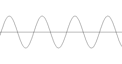
To explain light and how it relates to color vision, I like to make an analogy between light and sound. Sound is made up of pressure waves (typically in the air) of various frequencies and amplitudes. For example, the wave of a single pure tone looks like this:
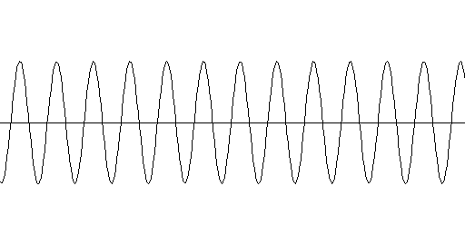
A louder version of that same tone looks like this:
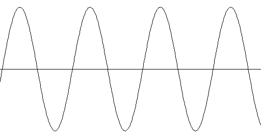
And a higher-pitched version looks like this:
However, most sounds aren't a single pure tone. Most sounds have many tones of varying pitch and loudness layered on top of each other. This is what produces the rich harmonies and textures we experience in sounds. For example, here is a graph of a more complex sound: a chord of three notes being played on a piano:
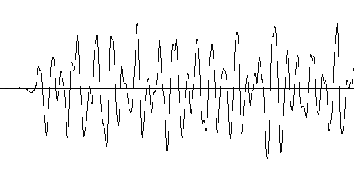
Quick question: can you tell that there are three notes being played in that graph? Me either. That's because these waveform-style graphs aren't a good visualization for this kind of discussion. A more useful graph for us is one that visualizes how loud the sound is at each frequency. Here is the same piano sound graphed1 that way:
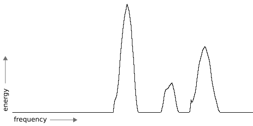
Notice how you can make out the three separate notes, which show up as three spikes on the graph. Neat!
Light is also made up of waves, but they are electromagnetic waves rather than pressure waves. Nevertheless, we can graph light in the same way. For example, here is a graph2 of highly saturated yellow light, showing its frequency spiking around the yellow part of the spectrum:
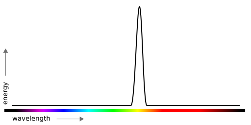
With sound, we perceive different frequencies as being different pitches. But with light, we perceive different frequencies as being different colors. If you had a machine that could produce any frequency of light, and had it slowly move through all the frequencies of visible light, you would see it produce all the colors of the rainbow one after another, as shown along the bottom of the graph.
However, like sound, most light isn't made up of a single pure frequency. Most light has a range of frequencies layered on top of each other. Unfortunately, although our ears are capable of hearing multiple frequencies at once, our eyes aren't that good, and are unable to perceive the equivalent of the three piano notes in color. And that brings us to the next topic!
Human Color Perception & Metamers
Our ears have thousands of tiny hairs that are each sensitive to different frequencies, which is what allows our hearing to distinguish so many frequencies at once. Our eyes, on the other hand, only have three types of light sensors for seeing color, which are called "cones". Each type of cone is sensitive to different frequencies of light: one is sensitive to the long wavelengths ("L"), one to the medium wavelengths ("M"), and one to the short wavelengths ("S"). We can graph the sensitivities of each type of cone like this:
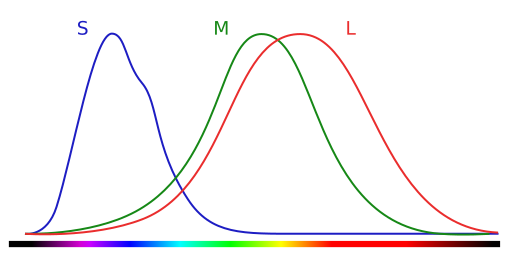
The curve for each cone represents how sensitive it is at different frequencies. Importantly, the cones cannot distinguish where within their sensitivity range they are being stimulated. For example, the L cone can't tell if it's being stimulated at its peak or at the far end of its left tail. All it knows is that it's being stimulated somewhere within that range.
Nevertheless, because the sensitivities of the cones overlap, if they all work together, they can triangulate a single spike (or "tone") in the light spectrum. For example, a pure yellow spike would stimulate both the L and M cones roughly equally:
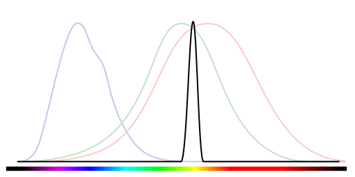
So we can make a pretty good guess that when the L and M cones are stimulated equally, the light spectrum is probably spiking at yellow. However, we could also have two spikes:
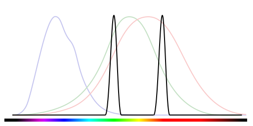
And... well, the cones can't really tell the difference between that and the single yellow spike.3
This is, in fact, how our digital color displays (such as computer monitors) work. I imagine you already know that they use red, green, and blue lights at different intensities to create different colors. But what may not have occurred to you is that the reason that works is because all humans are color blind.
When a computer monitor turns on the red and green emitters of a pixel to display yellow, it's taking advantage of the fact that we can't tell the difference between a harmony of red + green and an actual pure yellow. It is fooling our eyes into seeing a yellow that isn't really there. If our eyes were as good as our ears, they wouldn't be fooled—we'd see both the red and green simultaneously, not yellow.
The big take-away here is that there are a lot of light spectrums that our eyes cannot distinguish. And there is a name for that phenomenon: two or more different light spectrums that appear the same to a given observer are called metamers.
The difference between color blind people and people with normal color vision isn't the existence of metamers, it's the quantity of metamers and which spectrums are metamers. To drive that point home: there are animals such as the mantis shrimp that have far, far better color vision than us humans do, because the mantis shrimp has not just three color sensors in its eyes but at least twelve. Compared to the mantis shrimp, normal color vision people are horribly, horribly color blind—only slightly less so than people with impaired color vision.
This, of course, makes me feel a little better as a color blind person. But the reason it's actually relevant to discussion of color management, 3d rendering, etc. is because it highlights the difference between physical light and human color perception.
Light spectrums are a well defined physical phenomenon: you can measure them, you can make a graph, and that is simply what the light spectrum is. Color, on the other hand, is a perceptual experience caused by light. Light doesn't have a color, it is perceived as a color by a given observer, and it depends on the particular observer. You can still measure and graph color, but only on a per-observer basis.
Wrapping Up
If I've done a good job explaining things, then hopefully you've grasped everything here reasonably well. The concepts I've just introduced are, I believe, critical for understanding color perception and color management, so if any of this was unclear please let me know!
Lastly, for the actual color scientists out there: I realize that I've glossed over some things here. Sorry about that. Nevertheless, I hope you think this is a good introduction to the topic.
Bonus
This isn't super important, but it's a fun little fact. I said earlier that our eyes can't see harmonies in light spectrums, but that's not quite true. There is one harmonic color that we can see (albeit a very simple one): purple.
We see purple when there is energy in the long and short ends of the visible spectrum, but not the medium length part, like this:
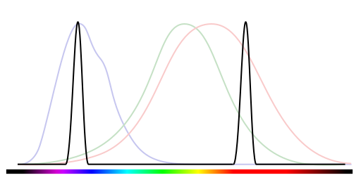
Our eyes can distinguish that because both the L and S cones will be strongly stimulated, but not the M cone. So for anyone who's favorite color is purple: congratulations, it's a very special color!
Footnotes
-
For the pedantic, the data for this graph has actually been further processed to isolate the fundamental frequencies of the piano. But the principle stands.
-
Most of the graphs in this post are just approximated by hand, so please don't take them as precise in any way. That's also why I (intentionally) left out the scales of the axes.
-
The astute among you might notice that the S cone actually gets stimulated a little, so the red-green combination isn't quite identical to the pure yellow in how it stimulates the cones. However, if you just add a little bit of energy everywhere in the pure yellow graph (making it a little less saturated of a yellow) then it would be. This is the first hint of something fairly interesting, which is that an RGB display can't reproduce all the fully saturated colors, even if the three RGB colors are themselves fully saturated.